
Most businesses spend months chasing more website traffic before ever asking a simpler question. What happens to the people who are already showing up? That gap is exactly what conversion rate optimization is built to close, and it usually costs far less to fix than another round of advertising.
Website conversion rate optimization is the practice of improving a site so a higher percentage of existing visitors complete a desired action, such as filling out a form, making a purchase, or booking a call, typically through changes to page speed, form length, messaging, trust signals, and layout, tested before being rolled out fully.
This guide walks through what genuinely moves the needle, how to measure where you stand today, which fixes tend to pay off fastest, and how to avoid the mistakes that quietly waste a testing budget.
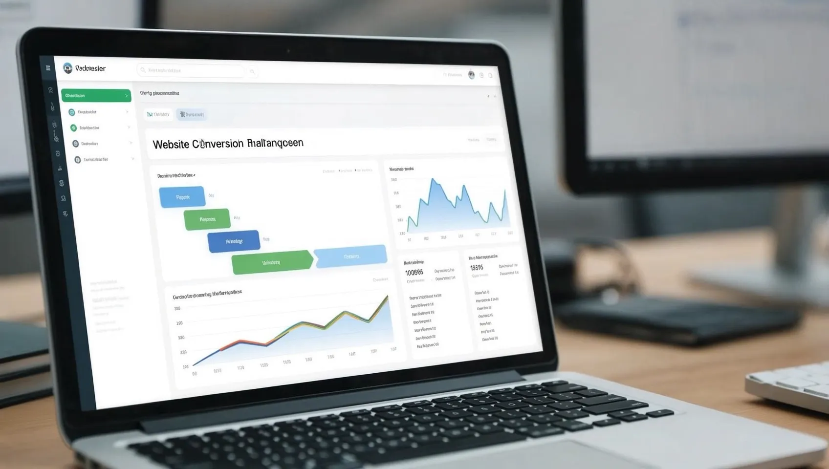
Why Conversion Rate Optimization Matters Now
A visitor who lands on your site once cost you money to get there, whether through an ad, an SEO ranking, or a referral. Losing that visitor without a real attempt at converting them means paying for the same opportunity twice, once to attract them and again later trying to win them back.
The scale of that leakage is larger than most business owners assume. The Baymard Institute has tracked cart abandonment across ecommerce sites for close to two decades, and its running average across 50 separate published studies now sits at 70.22 percent. That means roughly seven out of every ten shoppers who add something to a cart leave without paying, and a real share of that loss traces back to friction the business itself put on the page, not a change of heart about the product.
Conversion rate optimization treats that leakage as fixable rather than inevitable. A site does not need more visitors to grow. It needs a bigger share of the visitors it already has to actually finish what they came to do.
How To Calculate Your Conversion Rate
Your conversion rate is simply the number of visitors who complete a goal, divided by total visitors, multiplied by one hundred. A site with 2,000 monthly visitors and 40 completed contact forms converts at 2 percent, and that single number becomes the baseline every future change gets measured against.
Picking the right goal matters before running this calculation at all. An ecommerce store should track completed purchases. A service business should track booked calls or submitted quote requests. Tracking the wrong goal, page views instead of actual leads, for instance, produces a number that looks encouraging while revenue stays flat.
Google Analytics or a similar tool handles this calculation automatically once goals are configured correctly, though a surprising number of businesses never set this up properly and end up optimizing blind. Confirming your tracking works before changing anything on the page is the one step almost every guide on this topic skips.
What Counts As A Good Rate
There is no single universal benchmark, and treating one as gospel leads to the wrong conclusions. Nielsen Norman Group puts this plainly in its own research on the metric, noting that ecommerce conversion rates hovered around 1 percent during the early 2000s and had climbed to roughly 3 percent by 2013, with most sites today still falling somewhere between 1 and 10 percent depending on industry, price point, and traffic quality.
The more useful comparison is not against a generic industry average. It is against your own site's past performance. A rate that climbs from 1.8 percent to 2.4 percent over a quarter represents genuine, measurable progress, even if a competitor somewhere is sitting at 5 percent with a completely different product, price, and audience.
| Page Type | Typical Conversion Range | What Usually Holds It Back |
|---|---|---|
| Ecommerce checkout | 1 to 3 percent site-wide | Unexpected costs, forced account creation, slow checkout steps |
| Lead generation form | 2 to 5 percent | Too many form fields, unclear next step, weak headline |
| SaaS free trial signup | 3 to 7 percent | Confusing pricing, no clear differentiation, slow page load |
| Service business contact page | 2 to 6 percent | Buried contact form, no visible trust signals, no urgency |
Where Most Visitors Actually Drop Off
Every site has a specific point where visitors quietly give up, and finding it matters more than guessing at a fix. Heat mapping tools and session recordings show exactly where someone hesitates, scrolls back up, or closes the tab, turning a vague feeling that "conversions are low" into a specific, addressable problem.
Three drop-off points show up again and again. The headline, when a visitor cannot tell within a few seconds whether the page matches what they were searching for. The form, when the number of fields feels like more commitment than the visitor is ready to give. And the final step, a checkout page that reveals a shipping cost for the first time, or a submit button that gives no confirmation the request went through.
Fixing Landing Pages That Actually Convert
A landing page has one job, and most businesses accidentally give it several. The strongest pages strip out navigation menus, unrelated service links, and footer distractions, keeping a visitor's attention on one message and one next step.
Message match is the first thing worth checking. A visitor who clicked an ad promising a free consultation should land on a page about that exact consultation, not a general homepage covering five different services. That single alignment consistently produces some of the largest conversion gains available without spending anything extra on traffic.
Headlines deserve more attention than most businesses give them. A headline built around the visitor's problem, rather than your company name or a vague slogan, gives someone a reason to keep reading in the first few seconds, which is usually all the time a page actually gets.
Shortening Forms To Cut Friction
Every additional field on a form quietly taxes your conversion rate. Name, email, and perhaps one qualifying question is usually enough for a first interaction. Company size, budget range, and phone number can wait until a real conversation has already started.
Pages asking for a single piece of information tend to convert at roughly double or triple the rate of pages asking for seven or eight fields, since each extra field adds a small moment of hesitation that compounds the further down the form a visitor scrolls.
Field order matters too. Placing an easy, low-commitment question first gets a visitor moving before they reach anything that feels like real commitment. Saving the more sensitive questions for later in the sequence keeps the early momentum from stalling out.
Building Trust Signals Visitors Believe
A visitor deciding whether to trust an unfamiliar business is silently asking one question. Has anyone else actually done this and been satisfied? Reviews answer that question more effectively than almost anything a business can say about itself.
The Spiegel Research Center at Northwestern studied this directly and found that purchase likelihood for a product with five displayed reviews runs 270 percent higher than for a product with no reviews at all, with the effect even stronger on higher-priced products, where conversion rates rose by 380 percent once reviews were visible on the page.
Trust signals extend beyond star ratings. A visible phone number, a real business address, recognizable client logos, and a clear returns or guarantee policy all reduce the same hesitation reviews address.
Speeding Up Pages For Conversions
Page speed is not a technical detail sitting apart from conversion work. It is one of the biggest levers available, and it is covered in more depth in our complete guide on website design services, which walks through Google's own research finding that 40 percent of visitors abandon a page that takes longer than three seconds to load.
That abandonment happens before a visitor ever reads your headline, tests your form, or sees a single trust signal, which makes speed the one fix that protects the value of every other change covered in this guide.
Testing Changes Before Full Rollout
Confidence is not the same thing as evidence, and conversion rate optimization depends on the difference. A/B testing shows a portion of your visitors the current page and a portion a modified version, then measures which one actually performs better with real traffic rather than a guess made in a meeting room.
Testing one specific change at a time, a headline, a form length, a button color, produces a result you can actually attribute to something specific. Changing five elements simultaneously might improve conversions, but there is no way to know afterward which change deserves the credit.
Patience matters as much as method. A test stopped after two days of promising results usually reverses itself once enough traffic has passed through to reach statistical significance.
Why Mobile Experience Shapes Conversions
More than half of most businesses' traffic now arrives from a phone, and a page that only sort of works on that screen size is quietly turning away the majority of visitors before a desktop-focused fix ever gets noticed. A form that requires excessive zooming, a button placed too close to another tappable element, or text too small to read comfortably all cost conversions in ways a desktop review will never catch.
Checkout and contact forms deserve particular attention here, since typing on a phone already carries more friction than typing on a keyboard. Autofill support, larger tap targets, and a number pad that automatically appears for phone or numeric fields all remove small pieces of friction that add up across a full form.

A Real Conversion Rate Example
A regional home furnishings retailer came to a familiar conclusion after months of steady ad spend. Traffic was healthy, but online orders stayed flat no matter how much budget went toward driving more visitors to the site. A closer look at the checkout funnel showed the actual problem had nothing to do with traffic at all.
The original checkout asked for nine fields before a customer could complete a purchase, including a mandatory account creation step. Shipping costs appeared for the first time only after a customer had already entered their card details. Page load time on mobile devices ran close to five seconds.
Three changes went in over six weeks. Guest checkout replaced the mandatory account requirement, shipping costs moved to the product page itself, and image compression cut mobile load time down to under two seconds. Cart abandonment on the site dropped from just above the 70 percent industry average to roughly 54 percent within two months, with no additional spend on advertising and no change to the products themselves.
Common Mistakes In Rate Optimization
- Testing too many changes at once, making it impossible to know which change actually drove the result.
- Chasing more traffic before fixing the page, which simply multiplies the number of people who leave without acting.
- Copying a competitor's page without testing it, skipping the actual testing this discipline depends on.
- Ending a test the moment results look promising, before a full week or business cycle has passed through it.
- Ignoring mobile visitors during a redesign, missing the exact friction points that cost the majority of modern traffic.
- Redesigning the entire page instead of one element, making it far harder to learn what specifically worked.
A Simple Optimization Checklist To Run
- Confirm your analytics goals are tracking the action that actually matters, not just page views.
- Calculate your current conversion rate for your most important page as a real baseline.
- Review a heat map or session recordings to find where visitors actually hesitate or leave.
- Cut your primary form down to the fewest fields the next step genuinely requires.
- Add at least one visible trust signal near your call to action.
- Check your page load time on a mobile device, not just a desktop browser.
- Test one specific change at a time rather than a full redesign.
- Let each test run through a full business cycle before declaring a winner.
How This Connects To Branding
A high converting page still depends on the trust a visitor brings to it before they ever arrive, and that trust is shaped heavily by brand identity and brand image working together. A visitor who has already formed a positive impression of your business elsewhere converts at a noticeably higher rate on the exact same page than a visitor encountering your brand for the first time.
Our guide on brand identity vs brand image covers this relationship directly, including how a consistent, well-built identity gives every conversion effort a stronger foundation to work from.
This is also why conversion rate optimization tends to work best as part of a full website strategy rather than an isolated fix. Our complete guide on website design services covers how design, speed, and branding come together to support the same goal this guide focuses on.
FAQ
What Is Website Conversion Rate Optimization?
The ongoing process of improving a site so more of its existing visitors complete a specific action, usually through tested changes to speed, forms, messaging, and trust signals rather than a full redesign.
What Is A Good Conversion Rate?
Most sites convert somewhere between 1 and 10 percent depending on industry, price point, and traffic quality, though the most useful benchmark is your own site's past performance.
How Do I Calculate My Rate?
Divide the number of visitors who complete your chosen goal by your total number of visitors, then multiply by one hundred, after confirming your analytics tool is tracking the correct action.
Biggest Reason Sites Lose Conversions?
Friction is the most common cause, showing up as forms with too many fields, slow page load times, unclear messaging, or unexpected costs late in checkout.
How Long Should A Test Run?
At least one full business cycle, typically one to two weeks including both weekday and weekend traffic, rather than being stopped early.
Does Page Speed Affect Conversions?
Yes. Research from Google has found that 40 percent of visitors abandon a page that takes longer than three seconds to load.
Do Reviews Increase Conversions?
Yes, significantly. Purchase likelihood rises by 270 percent once a product displays five reviews compared to none at all.
Should I Hire For CRO?
Depends on available time and analytics expertise. A small business with basic tracking can apply many fixes directly, while a larger catalog often benefits from a dedicated partner.
Turning More Visitors Into Customers
Growing a business online does not always mean finding more visitors. It often means giving the visitors already arriving a clearer, faster, more trustworthy path to the action you actually want them to take.
RASS E-Vision builds conversion focused improvements into every website design project, alongside the branding and creative design work that gives those improvements a consistent foundation to build on.
Book a Free Consultation